RESPONSIVE WEB DESIGN: Everyone who’s anyone has it!
Whether you knew it or not, the content you’re reading right now is probably on a responsive website. If it’s not, it won’t appear normal on your phone, tablet and maybe even your laptop. Since more and more people are using their mobile devices to surf the web, new websites created today should be responsive.
 The Internet is ever changing. It’s darn near impossible to stay up-to-date with every new trend, app, and tweak your company needs to stay on top of the competition. You’d have to be a full-time web designer to understand the depths of the Internet ocean, and how you can succeed in such deep waters.
Luckily, we’re here to simplify a few things for you. And one of the simplest strategies you can use regarding the world wide web and how to optimize your online presence is to switch to a responsive web design. If your website is not fully responsive right now or maybe you’re unsure, keep reading.
The Definition of Responsive Web Design
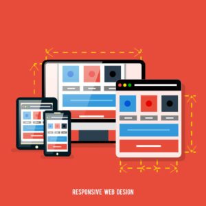
 So, what is responsive web design? Often, many clients tell us they think responsive design solely refers to the mobile layout of their website. We understand their confusion – the Internet can be extremely confusing. Responsive design refers to a website that was created to look the same (or similar) on all computer screens. From a desktop to a laptop to a tablet to a smartphone, you’ll find everything looks the same with a responsive website.
Responsive design is essential in creating web pages that respond to any type of device in a similar manner. Whether you’re viewing in landscape or portrait, the content will respond appropriately and look similar in every situation, orientation and screen size. With millions of different screens that people view the Internet with these days, being ready for any situation can be quite the feat!
Understanding the Various Devices
 Before we dive deeper into what entails a responsive web design, it’s important to comprehend the variations your website MUST be able to function properly in. These include:
- Computers
- Tablets
- Smartphones
- Portrait
- Layout
This is just the tip of the iceberg! There are millions of different screen sizes that your website must adjust to.
We Work From Our Smartphones Now
 Web sites initially were not created in a responsive manner. Not long ago there were only so many screen sizes and device types on the market. The vast majority of the web was displayed on desktop or laptop computer screens. Almost nobody surfed the web on their smartphone or tablet.
As you know, things changed! And they changed rapidly. The world now works from our smartphones. Mobile traffic has actually taken over desktop traffic. More people view the Internet from their phones than from their computer. No one would have guessed this ten years ago when the vast majority of web traffic was from a desktop computer.
 Since the advent of the smartphone it has become an incredible asset. We can handle nearly every aspect of our lives from our phone including:
- banking
- catching the news
- checking the stock market
- looking up recipes
- dating
- watching movies
- playing games
- staying in touch with loved ones near and far
How Does Responsive Web Design Work
 Today, you really need a website with a responsive design. There are simply too many screen sizes to adapt to. Your designers would be coding for years on end. The answer is a fluid grid. This grid layout can adapt and adjust to a variety of screen sizes. Your website needs a responsive design so it can respond to this fluid grid. Then every page element on your site adapts to proportions instead of pixels.
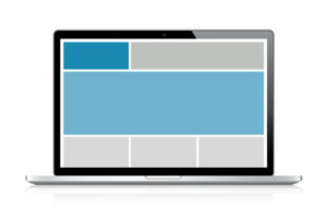
For example, if you have three columns on one page of your site, you cannot say how wide each column must be through numbers of pixels. You have to designate how wide each column must be based on the size of the other columns. So when a different screen size is used to view your site, the proportions stay exactly the same. In the case of your phone, the columns usually narrow from three down to one. You still see the same site design, but you scroll through it in one long column.
The Benefits of Responsive Web Design
If you haven’t yet been convinced of the vast benefits of a responsive web design, don’t worry. We’re about to convince you. Here are six more reasons why your website must be responsive in this day and age:
1. There are SEO Benefits
 Google loves responsive websites. Google hates sites that aren’t responsive. If your site isn’t responsive, you will be missing out on search traffic. A lot of search traffic! A major part of search engine optimization is usability. That includes load time, flexibility and more. Plus, your site is more likely to build links with a responsive design than without one.
2. It’s Flexible
Everything about this flexible type of design was created with ease of use in mind. By going responsive, your site will have the flexibility to move from screen to screen fluidly.
3. It’s Cost Effective
Many themes come packaged to operate in a responsive manner from the get-go. You don’t need a web designer to constantly update your site to respond to different screen sizes. That would take time and money.
4. It Keeps Things Simple
 Instead of having a mobile and desktop site, you now only have one site to manage. You can focus solely on one web presence. What a nightmare trying to stay on top of multiple versions!
5. It Enhances User Experience
Ultimately, a responsive design will keep your customers happy. They want to access the same content, information and products on their tablet that they do on their computers. Don’t confuse your customers. Keep things responsive and users will feel confident that you’re on the cutting edge online.
 6. It Means More Sales and Conversions
When you keep your customer happy and loyal, you’ll always end up making more money. Make the sales process responsive and straightforward on both mobile and desktop computers and watch sales soar.
Issues Regarding Responsive Design
Responsive web design is darn near perfect, but there are a few issues to take into consideration when designing for all devices. Think about these three challenges when converting to a responsive design:
1. Mouse vs Touch
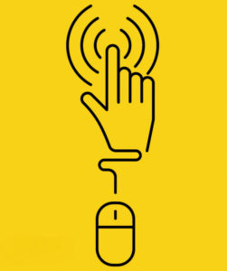
 Many still use a mouse on their computers. On your phone or tablet, you’re operating on touch. Fingers generally take up a lot more space on a smartphone screen than a pointer on a computer screen. So you must take this into account with your web design.
2. Graphics
You may want to work within your responsive design to remove some graphics and larger ads from the mobile version of your site. These images often look great on desktop, but don’t respond well in mobile.
3. Apps
 Some companies still create apps for their brand. This can be beneficial for customers ordering directly from your website, but the vast majority of small businesses will be better off by ignoring apps and sticking to optimizing their mobile site through a responsive design.
Responsive Web Design Gives You the Competitive Edge
 If you’re operating a small to medium sized business in today’s market, you probably don’t want to waste money on additional web design and updated technology. You’ve already allocated a lot to initial web design and other content marketing strategies. Attending to your online presence adds up quickly, but one place you don’t want to scrimp on is a responsive website design. It’s essential for keeping your company ahead of the competition.
Easy Access on Mobile Devices is Imperative!
 Responsive web design allows you to simplify how you operate online. You’ll be able to focus on one version and not worry about separating the desktop and mobile versions of your website. And with more people viewing the Internet from their phone than ever before, you’ll want to make sure customers can access every aspect of your site from their mobile devices. Your number one priority is to make every step in the sales process function easily through a smartphone.
Just check your traffic now. You’d be surprised how many people already view your site from a mobile device. If you haven’t already optimized the mobile version of your website, the time is now! Ultimately, responsive designs are the only way to stay ahead of the curve for companies managing their online presence. Learn more about updating your old website here.
Take Your Website From Retro To Responsive
If you’re ready to update your website with a responsive design, we are too! At iWebContent, we want to help you crush your online competition with a site that’s accessible on all computer devices. Not only will our responsive web design services help you get current with a responsive site, we’ll make sure new customers start flocking to your updated site with cutting edge digital marketing strategies. Get in touch today to learn more.


