Create the Call to Action Your Content Writing Deserves, part 2
10 Web Content Tips For Calling Attention to Your Call To Action
When you’ve decided what you want to communicate and have a real kicker call to action, you’re ready to learn some of the many ways to make those words work.
-
Tie in with the Rest of the Content
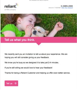
Whether it’s site content, blog writing or messaging within your social posts, the call to action wording should be harmonious with the tone and graphics of the rest of the piece. In the email below, the business wants feedback on a recent service. The pink bar with headline “Tell us what you think” is echoed in the call to action, also in a pink bar and repeating the words “Tell us.”
-
Use a Different Color
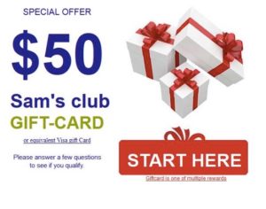
If you want to maximize impact and leave no uncertainty about what to do next, a big, bold red call to action button couldn’t be better. Giving the response bar a color that coordinates yet contrasts with the overall design directs the eye to what is the most important part of your ad.
-
Dazzle With Discounts
Try mixing up your discount messages in your content marketing. If you can give 50% off to the first 100 shoppers, you are combining that sense of urgency with an impressive savings. (Remember the fear of missing out is a powerful motivator.) Free shipping works because free anything works. Make it available for a limited time only and you amp up the need to act.

-
Choose a Command Verb
Active verbs like Register, Download, Redeem and Request are good words to place on your call to action buttons because they subconsciously get a buy-in from the user to commit to the action. No further selling is required. Retailers can use Buy, Shop or Order. Agents can use “Depart” or “Go to Event.” We’ve become accustomed to clicking these, so the colorful tab automatically registers as the place to go to access the website or product page.
The ad below clearly states what is wanted with the button “Contribute.” A click consents to the next step, making a donation.

-
Invite Involvement
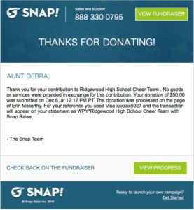
Fundraising sites employ a clever call to action that encourages donors to keep tabs on the total raised for their group. The “View Progress” button is a great way to get visitors to return often and notice the message that says they can start a fundraiser of their own with Snap.
-
Lead with the Problem
What can your company fix? Work problem, health problem, house problem? Think about the benefits of your product or service then flip that around to find the problem. Promote the unique solution only you can bring to the table.
In this call to action, “Get Free Estimates” satisfies the curiosity and sets energy wasters on the road to recovery.

-
Be Mobile Minded
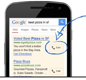
A call to action need not be a button on a printed page. It’s any command to do something that will deliver information or involvement. For instance, if you’re giving a lecture you might ask your listeners to text “transcript” to you to receive a printout of your talk. This lead generation technique captures their phone numbers for future communications and gets a better response than asking people to go to the website and download the paper. So much is gravitating to the phone now it requires a separate approach. If your budget permits, Google AdWords Click-to-Call function displays a small “Call” button for one-touch dialing.
-
Get Creative
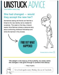
Your call to action doesn’t have to be plain vanilla and you can have more than one. Instead of a generic “Read more,” the clever contrivance below uses “Find out what happened.” A “handwritten” note below offers a free weekly quote when you like them on Facebook. There’s even a third small CTA share message, all in keeping with the casual freestyle context.
-
Try, Try Again
A Netflix subscription can be considered a luxury for some, until they’ve binge-watched House of Cards. If at first you don’t succeed…give them another chance. Here’s how a call to action aimed to entice with a second free sample. The bright red bar is clearly displayed with plenty of space around it.

-
Take the CTA Test
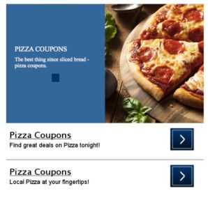
Forget the focus group. This pizzeria chose to use two CTAs in the same ad to determine which pulled the most click throughs: coupons that offered deals in general or coupons for restaurants located nearby.
So there you have some important information about the importance of CTA creation. However you decide to present your call to action, just remember it can always be improved. Analyze the response and readjust. If you’d like help from a team of content marketing pros, feel free to pick up the phone. After all, your next lead-generating call to action is just a phone call away!


