Color Psychology 101: Infusing Emotion into your Content Marketing
Red signals stop and the pool glistens blue.
How many colorations can we construe?
Pink is feminine, blue is for boys.
Red and green signify holiday joys.
Caution lights, sunshine and cowards are yellow.
Pastel, cool and subdued shades mean mellow.
The colors seem endless from Zucchini to Azul.
I could go on…but I must write this article.
Hue Can Do It!
So when it seems like all the good tones have been taken, how can you use hues to advance your content marketing from obvious to envious? From three primaries (red, yellow, blue) and three secondaries (purple, orange, green) come the color kingdom as all the tertiaries mix and remix. It takes an artist experienced in using infinite color combinations to design something uniquely appealing and unforgettable. Web design is highly dependent on the right choice of colors. In fact, it’s one of the key drivers of response and behaviors. Using color strategically can influence brand perception and site engagement. While no single color will instantly increase page views or social media shares, color choices can still have a profound impact on user experience.
Psych-color-gy
Color psychology is a scientific look at how colors influence human behavior. Branching off from behavioral psychology, the study looks to derive statistical data for subjects such as:
- How the visual aspect (design, color, openness) influences purchase decisions over touch, taste and smell
- How fast color subconsciously influences a quick purchasing decision
- What percentage of information is comprehended and retained on colorful pages over black and white
- The impact of color on navigation and call to action buttons
- Effectiveness of color in tuning out distractions
- Controlling emotional response by color choice and strategy
- Conversion rates comparing colorful vs monochromatic sites
- Color preferences by gender
Studies devoted to the psychology of color are as thick as a stack of Pantone swatches.
The traits attributed to certain colors can sound more like aspects of an astrological sign or mood ring. Nevertheless, there is something to be said for the way color affects mood and emotions in content marketing.
Shining Example
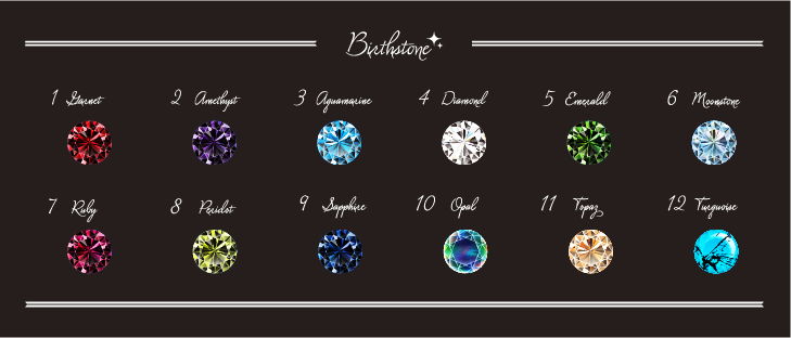
In George Frederick Kunz’s The Curious Lore of Precious Stones, published in 1913, the resident gem expert at Tiffany & Co. managed to sell more jewelry by calling out the prosperous (and sometimes preposterous) emotional properties of colored stones.
Ruby (red) Protects from misfortune and bad health; opens the heart and promotes love. Symbolizes friendship, vitality and royalty. Often used by hospitals and medical clinics, i.e. The Red Cross.
Garnet (dark red) Reflects passionate devotion to friends, family, self and purposeful living. Thought to stimulate the senses, increase stamina and attract good luck in business ventures. Examples: CNN, Red Bull, Puma.
Amethyst (purple) Calms the emotions, brings clarity of thought, facilitates the attainment of wisdom. Attuned with intuition, feelings and values, it is said to aid in combating food, alcohol and other addictions. Used by Curves, Cadbury and Hallmark.
Citrine (yellow) Opens the mind to new thoughts; balances impatience and restlessness. Promotes optimism, mental focus, endurance and self-esteem. Dubbed the “merchant’s stone,” it’s often placed on the desk or counter to acquire abundance and maintain wealth. See Best Buy, Sonic and Cheerios.
Peridot (green) Strengthens life; attracts prosperity, growth and openness. Helps one understand relationships; alleviates depression, anger, fear, jealousy and anxiety. Found on Starbucks, Land Rover, Tic Tac and H&R Block.
Topaz (blue) Encourages higher thinking and reasoning. Favorite of writers, artists, scholars and intellectuals. Associated with courage–facing one’s fears and overcoming obstacles. Said to reduce mental anguish and promote friendship, fidelity, integrity and kindness. Check out Twitter, AT&T, PayPal and Blue Bell Ice Cream.
For Every Woman, A Season
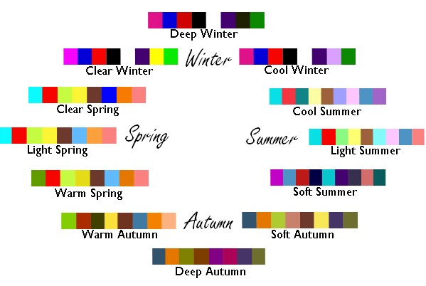
If the ancient guesswork of gemstone lore seems a bit loosey-goosey, website designers can take a lesson from the pages of fashion history. When it comes to clothes, why do some colors pop and others poop out? Back in the ‘70s, there was a curious phenomenon that really caught on. At home parties, a consultant would assess the skin tone, hair shade and eye color of a guest’s face and determine if they were a Summer, Spring, Autumn or Winter. From there, a color chart would be provided to show which shades of clothing would best compliment your “season.” It was an ingenious way to get ladies excited about changing out their wardrobes, adding new accessories and replacing all that unseasonably-wrong makeup. You couldn’t go anywhere without hearing, “Have you had your colors done?” or “You’re probably a Winter.”
The same principle can be applied to choosing a color scheme for your digital marketing image. Ask yourself one question: What qualities do you think your brand exudes?
- Open, airy, lighthearted and carefree? It may be yellow.
- Serious, comprehensive, precise, detailed, exacting and incontrovertible? It might be black with charcoal undertones.
- Ecocentric, nurturing, loving, responsible, life-affirming and vegan? It might be fifty shades of green.
Before you show your true colors, know your company’s key traits or the target audiences you hope to attract. Discussing them with an experienced website designer will elucidate the graphics to meet those goals. Creating action through color artistry is a marketing tool you won’t want to miss. For help with mixing colors, draw on our expertise. We’ve been known to make the design process a little more palette-able.

